dennisdegraaff
creative designer


Background
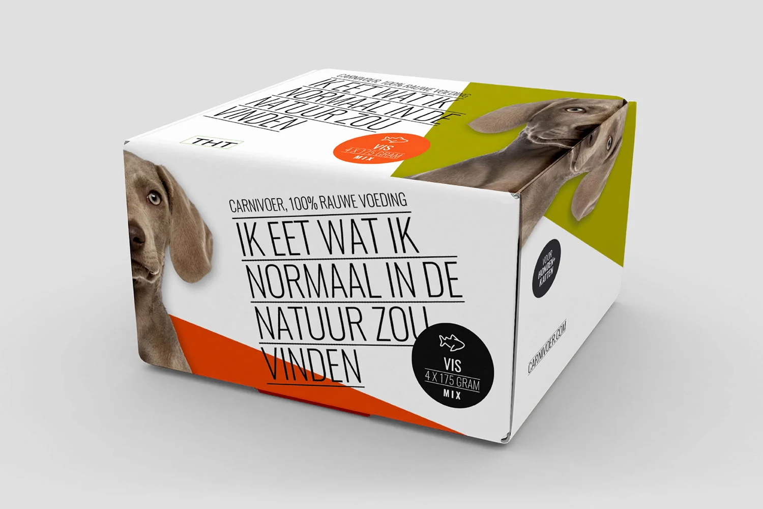
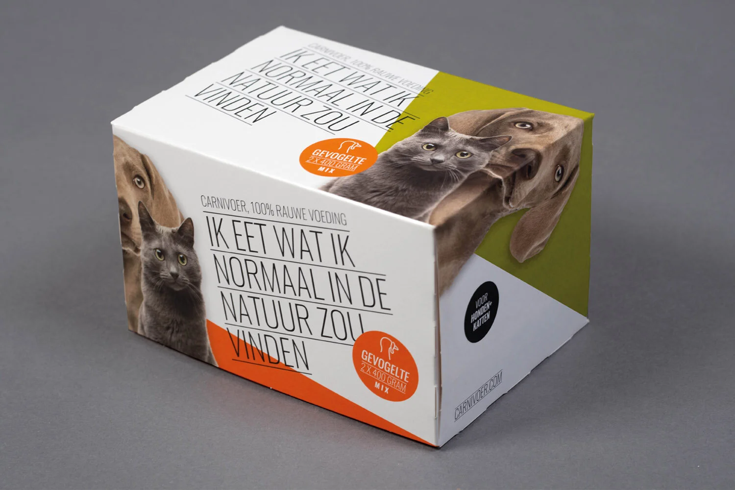
Earlier this year I was instructed to carry out a restyling for the visual identity of Carnivoer: a label for raw meat intended for the domestic dog and cat. It claims her source has a natural origin with positive effects on health. The formula itself is distinctive, but it takes new effort to stand out in the store shelfs for her old jacket had become dusty.
Approach
For that reason I developped a packaging line mainly supported by black typography set in a dominant way to catch maximum attention, furtherly enhanced by a strong orange green palette. Its graphic triangels (The typographed text) run over all sides so each has it's own appearance making the package interessting from all points of view. Moreover doing so it doesn't matter how the package is placed on the shop shelf being communicative at all times/keeping the attention of the audience. At least as much time is spent on how the message is shaped. Notice its strength lies in the direct way the dog and cat speak to the consumer. The simple but effective style has been further rolled out in website and printed matter.