dennisdegraaff
creative designer


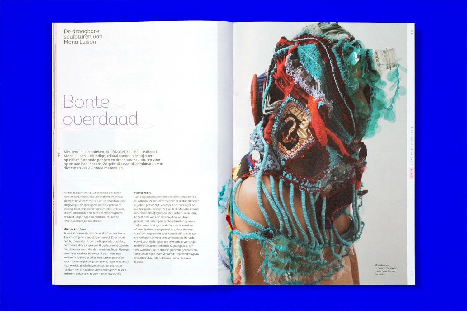
Background
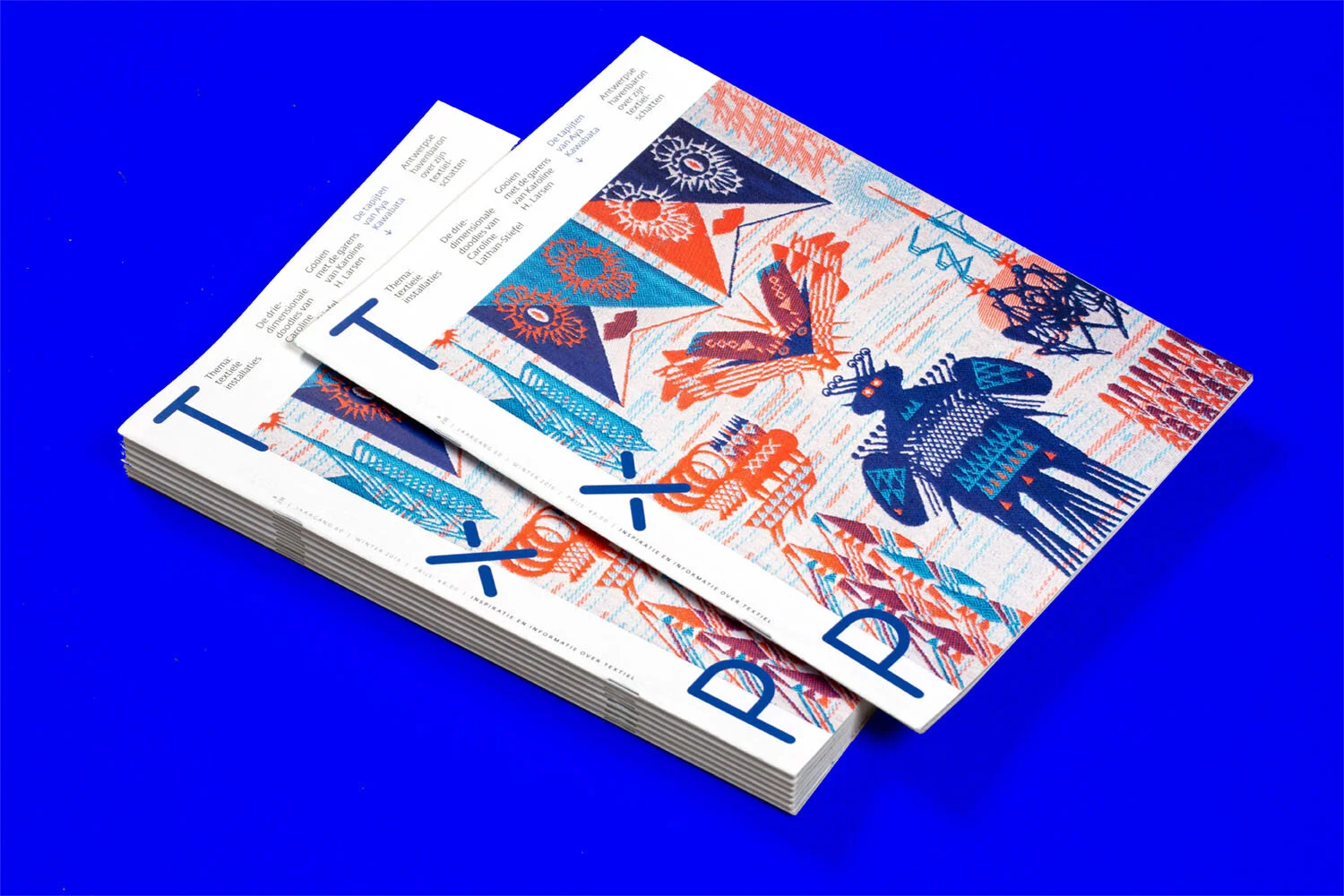
Grannies are pretty cool and so are their hobbies. Today there is also a steadily growing group of young people engaged in knitting, sewing, and embroidery. TxP is a magazine that highlights these underestimated crafts. One asked me to make a strong restyling for the old format was used for more then twenty years. Part of the process was to examin new ways to build up the magazine both in terms of content and form.
Approach
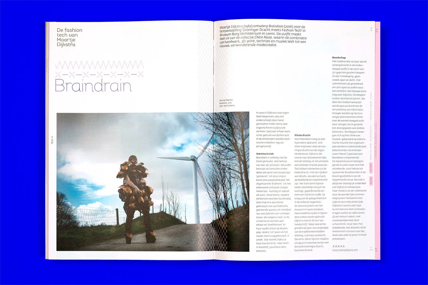
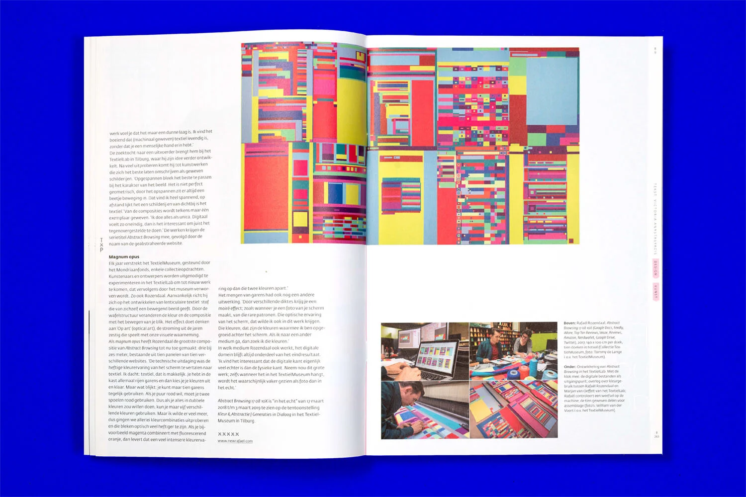
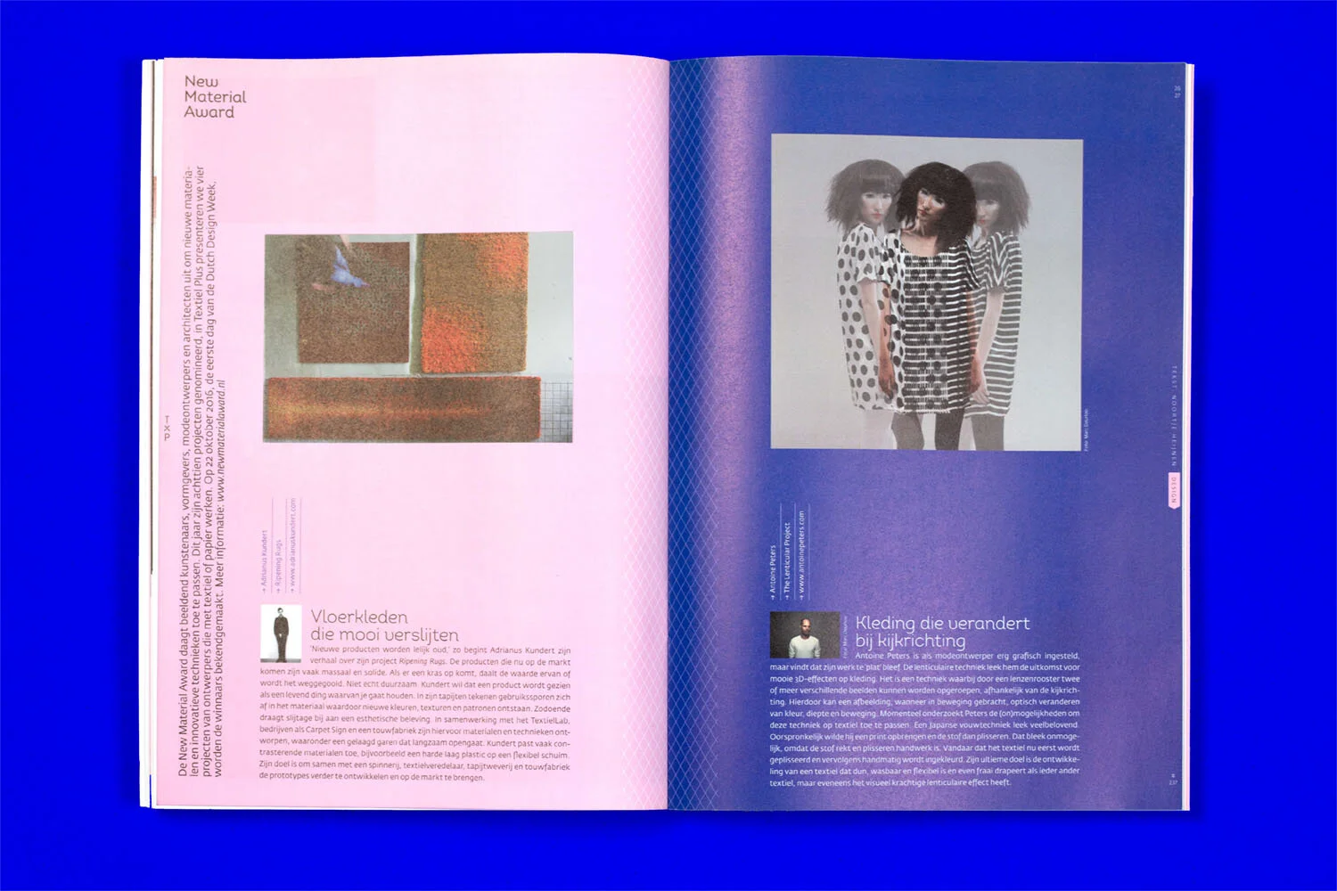
By introducing cross-over-areas such as art, design and fashion, more diversity and a bigger platform was created. I decided to shorten the old name Textiel Plus to TxP. By doing so it became sharper and more brand-able. The clear logo that followed can be easily applied and forms a visual anchor on the cover. In the magazine interior, the 'x' from the logo is frequently used for patterns creating a nice second layer. Furthermore I wanted the layout to be airy and the typography slightly feminine, matching the delicate nature of textile. At the end each release reflects the richness, creativity and innovation of this beautiful art.